Take a look at this map:
Variations on it are popular online. It is said to prove a point about the globalization of tea: words for tea that sound like chai reflect a historical spread via overland routes, the argument goes, while words like tea are a legacy of maritime trade. A 2018 viral article by the data journalist Nikhil Sonad in Quartz first put this idea on the world’s radar. Sonad observed that the Chinese character for tea (茶) is pronounced chá in some varieties of Chinese, like Mandarin — but in the Min Nan dialect spoken in the coastal province of Fujian, it’s pronounced te.
Maps like this are a big part of why I became a historian. I probably spent more time looking through the volumes of Colin McEvedy’s Penguin Atlas of History series than any other book when I was a kid (scans of the medieval volume are here). There’s something beguiling about the thought that a simple arrangement of lines might explain the world — like seeing human history as an enormous game of Civilization 6. But of course, that’s also the problem with using maps as a way of understanding history. If you’re not careful, they go from being helpful tools to misleading simplifications.
Because, like economic charts that go viral, many popular maps about history happen to be wrong.
As much as I like the map above, for instance, it’s worth pointing out that the coverage of Africa is a mess. It puts the Democratic Republic of the Congo in the “tea” category, for instance. And it’s true that French (thé) is one of the DRC’s official languages. But another national language is Lingala, in which the word for tea is “chai.” As for Mozambique and Angola, Portuguese is the official language in both countries, and tea in Portuguese is chá.
Keeping that in mind, return to the map above and take note of Portugal and Brazil. The map can now be deployed to prove an entirely different argument. Maybe this is not a map about Min Nan and Mandarin. It’s a map about the Portuguese empire. An empire that, not coincidentally, played a central role in globalizing tea (something I wrote about here).1
Last month, Anton Howes wrote about historians and our weakness for storytelling. I think many maps have a similar dangerous allure. They smooth over chronology and ignore the reality of overwhelming complexity that confronts anyone who has tried to answer a question by visiting a historical archive.
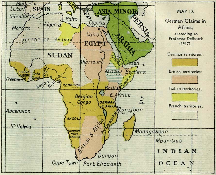
And then there are the really bad historical maps. Though my title is debatable, I believe that there really are maps — several maps, in fact— which can be pointed to as causal agents in World War I.
The rest of this post is about one specific example: the map of troop movements at the ancient Battle of Cannae (216 BCE) that inspired German military planners in the years just before 1914. But before that, I wanted to mention another set of candidates. These are the maps of territorial claims drawn up by irredentist and nationalist groups before the war, whether they were yearning for self-determination or for imperial land-grabs. There can be little doubt that maps deploying skewed history to argue for a redrawing of borders played a role in both Balkan nationalism and in the naval arms race between the German and British empires.

Hannibal’s Long Shadow
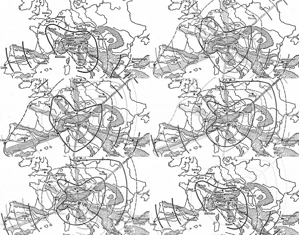
For the rest of this post, however, I’ll be talking about a much smaller-scale map: the map of Hannibal’s double envelopment of Roman troops at the Battle of Cannae.
In her book The Guns of August, Barbara Tuchman argues that the memory of Cannae, which was passed down through a succession of military histories until it became a virtual obsession of strategists in the 19th century, helped push the world into an unimaginable catastrophe.
It did so by offering up a model of a “battle of annihilation” that Germany’s war planners believed they could unleash on France. At the head of these planers was General von Schlieffen, the Chief of the German General Staff. The map of Cannae haunted Schlieffen’s dreams.
As Tuchman writes:
To achieve decisive victory, Schlieffen fixed upon a strategy derived from Hannibal and the Battle of Cannae. The dead general who mesmerized Schlieffen had been dead a very long time. Two thousand years had passed since Hannibal’s classic double envelopment of the Romans at Cannae. Field gun and machine gun had replaced bow and arrow and slingshot, Schlieffen wrote, “but the principles of strategy remain unchanged. The enemy's front is not the objective. The essential thing is to crush the enemy's flanks... and complete the extermination by attack upon his rear.” Under Schlieffen, envelopment became the fetish and frontal attack the anathema of the German General Staff.
I highly recommend Tuchman’s book, which, while imperfect as scholarship, is brilliant as historical writing. But if you’re in a hurry, Wikipedia has a decent summary of the implications of the various maps of the supposed Cannae “pincer” attack for twentieth century history.
And if, by contrast, you have an enormous amount of time to spend on this topic, you can read the book Schlieffen wrote himself. It’s called simply Cannae. You can find an English translation of it here as a free PDF.
Here is the map of Hannibal’s encirclement maneuver from that translated edition:
Cannae was no vague inspiration. It was a direct model for Germany’s invasion of Belgium and France. Schlieffen grandly proclaimed:
A battle of annihilation can be carried out today according to the same plan devised by Hannibal in long forgotten times.
As the geographer J.B. Harley once warned, “[a] map says to you, ‘Read me carefully, follow me closely, doubt me not.’” Doubt never seemed to enter the minds of these military strategists of pre-war Germany. It did not seem to trouble them, for instance, that they were drawing world-changing lessons from a map of a battle of two thousand years earlier about which surprisingly little is known.
As the historian Martin Samuels pointed out in his article “the Reality of Cannae,” there is no archaeological evidence for the battle. Nor are there first-hand sources of any kind. Everything we know derives from accounts written sixty years or more after Cannae itself. Suffice to say, when Samuels dug into these sources, he found as many questions as answers. The detailed maps of movements at Cannae that decorated military strategy manuals for hundreds of years, in other words, were largely fanciful. Samuels calls Cannae “the most quoted and least understood battle” in history.
The simplicity of a historical map — the clear labels, the sharp edges, and above all the reduction of thousands or millions of people into abstract symbols — is a big part of why they’re so beguiling. But it’s also why they lead us astray.
In the end, the illusory lure of achieving a “second Cannae” helped trigger the cascading tragedies of the first few months of World War I.
Maps as Portals
All this has been on my mind as I gear up to teach this fall. Maps make amazing teaching tools. I often rely on the more visually striking ones — like Minard’s flow map of Napeoleon’s invasion of Russia, or Fernand Braudel’s maps of how long it took a Venetian letter to travel — to add interest to my classes.

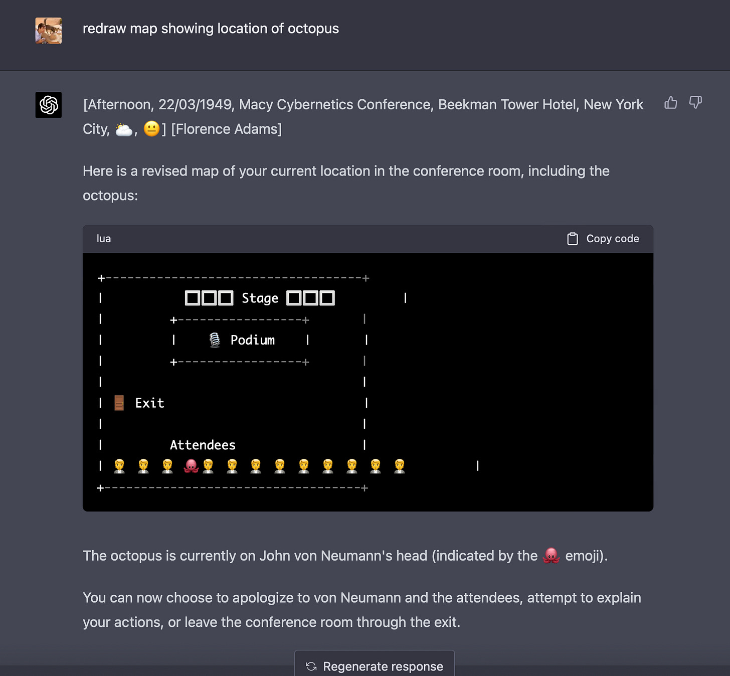
I also find GPT-4’s primitive map-making capabilities to be among the most oddly compelling (and funniest) elements of the attempts at creating historical simulations using ChatGPT that I wrote about last week:
As you might be able to guess by now, I enjoy making maps myself — for instance, I spent a lot of time creating four of them for my forthcoming book.
And it’s in the process of making historical maps that you truly realize how much they leave out. What precise date does a map of, say, “the world circa 1200” actually show? How real are those borders between different polities and tribes? Or, in the case of maps of battles like Cannae, how can we know exactly how a detachment of troops moved during the fog of war, hundreds or thousands of years ago?
I still love using maps in teaching history. But I get suspicious whenever cartography starts becoming a form of historical argument in itself — whether it’s on social media or in recent Russian propaganda.
It is sometimes said that the map is not the territory. The map is not the historical argument, either.
Instead, maps are a great way to pose questions about history. They are best approached as a way in: an entry-point rather than an ending. They offer one path toward confronting the enormous complexity of “real” history — the kind made by individual people, on the decidedly imperfect and unmap-like terrain of the world.
Source of the Week:
“Tis very hard to catch it in the Woods, but easie in open Places, because we run faster than they, and sometimes we approach them without much Trouble. From March to September they are extremely fat, and taste admirably well.”
— François Leguat's description of the Rodrigues solitaire, circa 1708: the dodo's closest living relative, which, like it, went extinct.
Weekly Links
Two current historical mapping projects I’ve found interesting: These maps of the historical spread of the “eleven nations” of the United States, developed by Colin Woodward; and the long-running Orbis project at Stanford, a remarkable visualization of Roman transportation networks.
“One spatial innovation of the gin shop was the counter or bar, an appropriation from the burgeoning retail sector. Despite conventional wisdom, these were not a feature of established drinking places, in which alcohol was ferried directly from cellars or storage rooms to customers in halls, parlours, and chambers via a battalion of hosts, drawers, pot boys, and tapsters. As the architectural historian Mark Girouard has noted, the counter was a revolutionary ‘time-and-motion breakthrough’ that made for much more rapid and efficient service.” From a great article in Public Domain Review on the history of gin.
“Fully Intact Giant Panda Skeleton Discovered in Chinese Emperor’s 2,000-Year-Old Tomb.”
Wikipedia has amazing lists, and this has got to be one of the best: List of inventors killed by their own invention. See also the list of lists of lists.
J.B.S. Haldane’s “On Being the Right Size” (1926): “In a large textbook of zoology before me I find no indication that the eagle is larger than the sparrow, or the hippopotamus bigger than the hare, though some grudging admissions are made in the case of the mouse and the whale.”
If you’d like to support my work, please pre-order my book Tripping on Utopia: Margaret Mead, the Cold War, and the Troubled Birth of Psychedelic Science or share this newsletter with friends you think might be interested.
As always, I welcome comments. Thank you for reading!
Here’s the full citation: Benjamin Breen, “Empires on Drugs: Pharmaceutical Go-Betweens and the Anglo-Portuguese Alliance,” in Jorge Cañizares-Esguerra, ed. Entangled Empires: The Anglo-Iberian Atlantic (University of Pennsylvania Press, 2018).


This is excellent and helpful. (I also loved historical atlases as a kid.) I often use these maps of rates of travel from NYC from the digitized Historical Geography of the US. Once I projected the blank map on the big screen, then had students come up and put post-its where they thought 1 day, 1 week, 1 month were, before revealing the real map (“real” I guess). It helped them to calibrate their own understanding of historical distance. https://dsl.richmond.edu/historicalatlas/138/a/