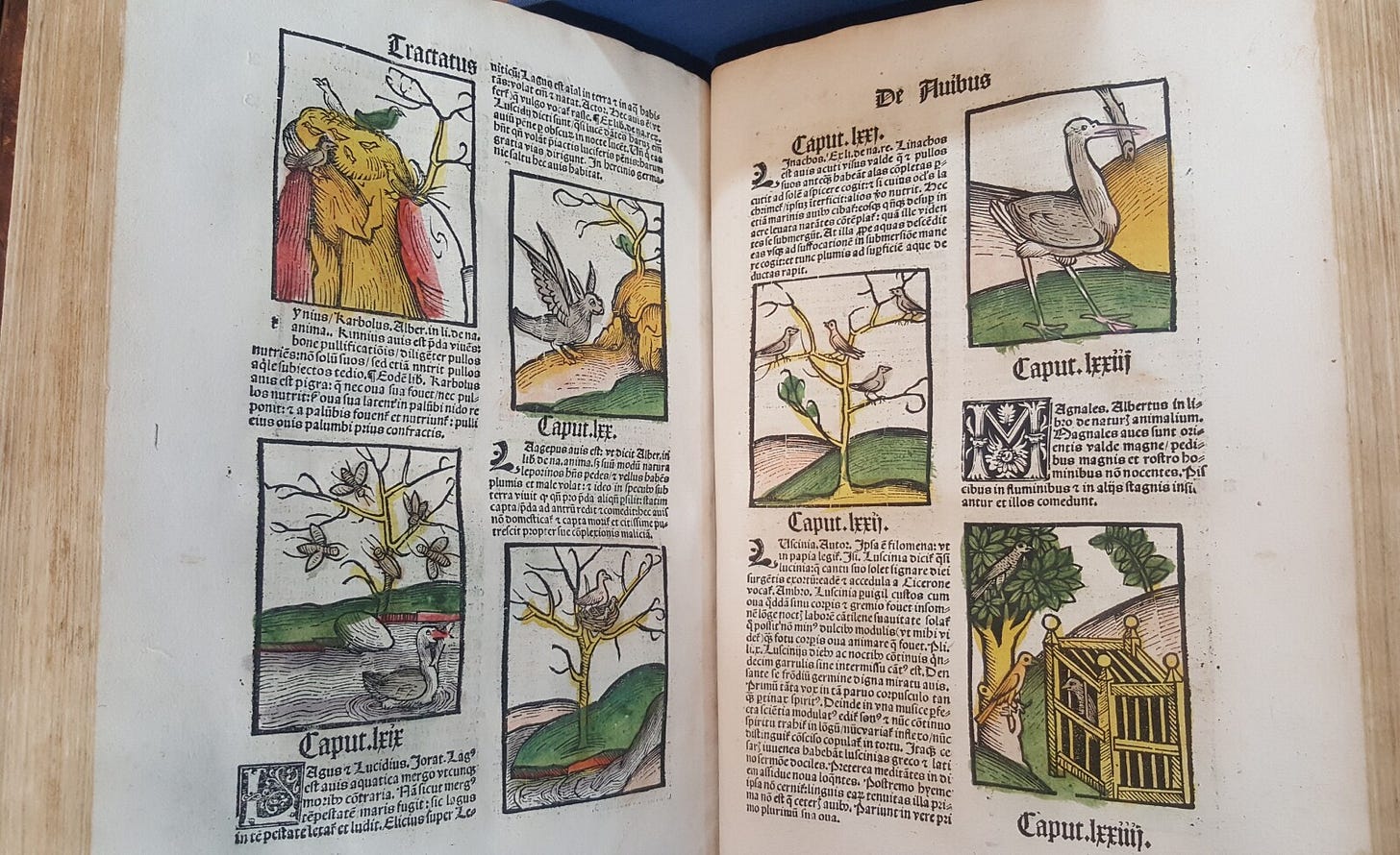
The Hortus Sanitatis (Latin for The Garden of Health) is an encyclopedia about the natural world that was first published in Mainz, Germany in 1491. It features 530 chapters on plants, 164 chapters on land animals, 122 chapters on flying animals, 106 chapters on animals that swim in the sea, and 144 chapters on precious stones and minerals. It is 454 pages long.
These are the ways that bibliographers tend to classify books. But nothing I can tell you about the Hortus Sanitatis will do justice to what you learn from looking at it. Because numbers aside, the most salient thing about this book is that it’s incredibly beautiful.

I am sometimes asked why I became a historian. A big part of it is that I just really like looking at old books. Not just looking, exactly, but finding out what we can learn from looking at them — how the meaning and function of a book interacts with the technologies used to produce it and the creativity and craftsmanship of its creators.
The Hortus Sanitatis is what’s known as an incunabulum, or “cradle book,” a term for books produced before 1500 during the infancy of movable type printing. These books have some recognizable traits:
They were often printed in black letter (Gothic) font.
Reflecting their transitional status between the world of manuscript books and printed books, they borrow stylistic elements from late medieval manuscripts.
They were rare and very expensive, and thus typically created for social elites and official functions — academic treatises, encyclopedias, Bibles, and the like.
Early modern printed books are a much wider category, encompassing the entire period between ~1450 CE and ~1800 CE (I tend to date the end of the early modern period to the end of the Napoleonic Wars, 1815). Printed books from this period cover a huge range of topics and dozens of languages, but for me at least, they have one thing in common: I almost always find them far more interesting — more beautifully designed, more strange, more intriguing — than modern books.
The rest of this post is a few thoughts on why.
Thesis #1: Early modern books occupy an uncanny valley of familiarity
I first encountered Hortus Sanitatis as a PhD student at UT Austin over a decade ago. I was in UT’s rare books library, the Harry Ransom Center, reading through 18th century books for a class assignment, and decided on a whim to look up the oldest printed books in the Ransom Center’s catalogue.
It turns out the oldest is their copy of the Gutenberg Bible. Considering it’s worth over $20 million, this is not something you can check out at the circulation desk!
But the Ransom Center’s librarians were happy to let me look through Hortus Sanitatis (which, if you’re wondering, is a relative steal as far as incunabula go, with copies priced at roughly 100k).
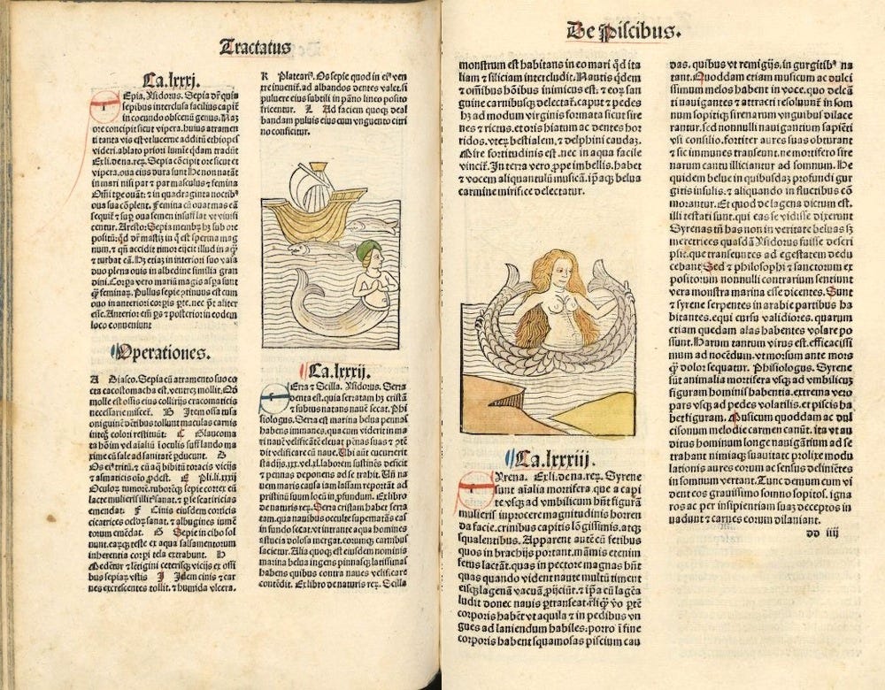
One of the first parts I remember noticing was the section on mermaids. If the mermaid at right looks oddly familiar…
… that’s because it or a similar woodcut was a direct inspiration for the ubiquitous Starbucks logo.
The format of early modern books is also familiar to any reader: there’s a dedication, a prologue, a table of contents, an index. Sometimes there are even “blurbs” from other eminent authorities recommending the book.
But even though the same basic pattern is there, the execution is totally different.

Thesis #2: Early modern printers thought a lot about design
Incunabula like the Hortus Sanitatis are very large books, but because they are divided into columns, the reading experience is surprisingly eye-friendly, provided you are ok with reading Gothic black letter font. A key thing to keep in mind about early modern books is that the type was all hand-set, and (because printed books were luxury items created by master craftsmen) a huge amount of time was spent experimenting with ways to arrange the text in a maximally visually appealing way.
Interestingly, this led to a convergence with certain principles of modern web design. For instance, I counted out the total characters in a few full lines from the first edition of Hortus. They average roughly 35 to 45 characters across, which is what contemporary designers recommend for mobile view on websites.
Here’s the New York Times mobile site compared with a column from Hortus:
This is just scratching the surface of the other design features of early modern books, from gorgeous marbled endpapers to the unhesitating use of a half dozen different different fonts on a single page. Above all, early modern books were experimental.
Including even the advertisements…
Thesis #3: Early modern books are incredibly charming, even when they’re trying to sell you something
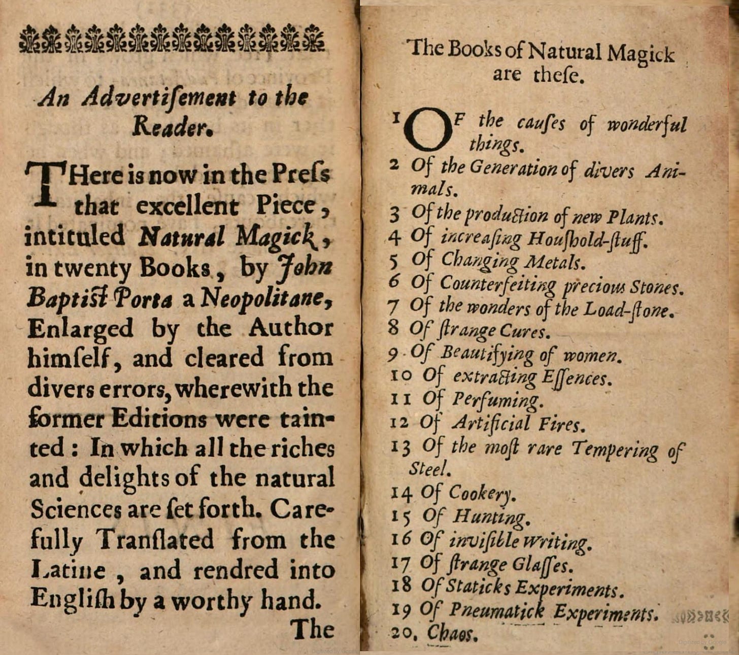
As far as I can tell, some of the earliest mass-produced advertisements were seventeenth-century “advertisements to the Reader” like the example above. It’s from a 1672 medical treatise called The American Physitian which is mostly famous today because the author was obsessed with the health benefits of hot chocolate.
Here again, the uncanny valley of familiarity. Readers in 2023 are no stranger to “advertisements to the Reader,” after all. But what an advertisement!
Not only does the ad promise that the book — an English translation of Magia Naturalis — will unlock “all the riches and delights of the natural Sciences,” it then proceeds to list all twenty of the magic books which you, lucky buyer, will receive for the price of one (they were bound as a single volume).
I especially like #17, “Of stranges Glasses.” And of course the final book, “Chaos.” Now that’s an ending.
Early modern indexes are also a trip. I wrote about one especially strange one, by the buccaneer William Dampier, here. One of the many things I love about The Public Domain Review is that they created an early modern-style index for their site which was partially inspired by oddities like Dampier’s index.
Finally, there’s the interesting branding that went into the names of booksellers’ shops. Hughes American Physitian, for instance, was sold “at the Green Dragon”:
This was meant quite literally. There actually was a green dragon.
A painted sign of one, at least, as this article from the Folger Shakespeare Library explains. Try Google searching for “to be sold at the signe of” and you will find early modern books being peddled at such places as “the Sign of the White Lion in Duck-Lane” and “the sign of the Bible in Popes-head-Alley.”
Sometimes this info about the bookseller tells a tiny story in itself, like this Spanish book from 1748 that was printed “by the heirs of the widow of Juan Garcia Infanzón” (who, it turns out, had a pretty sweet printer’s mark of a lion holding a starry shield).
Primary source quote of the week
Chocolate is most excellent, it nourishing and preserving health entire, purging by Expectorations, and especially by the sweat-vents of the body, preventing unnatural fumes ascending to the head, yet causing a pleasant and natural sleep and rest; preserving the person vigorous and active, sending forth all vicious humours to the Emunctorites… and being eaten twice a day, a man may very well subsist therewith, not taking any thing else at all.
— William Hughes, The American Physitian (London: Printed by J. C. for William Crook, 1672) (link).
Weekly links
• My good friend Christopher Heaney’s book comes out this week. It’s the one I used as an example of a contemporary book dedication above, and it’s called Empires of the Dead: Inca Mummies and the Peruvian Ancestors of American Anthropology. It’s the culmination of 15 years of amazing historical research (including that time in 2010 when Chris spent roughly an hour telling me how Inca surgeons performed trepanations using obsidian scalpels). You can order it from the publisher, Oxford University Press, or via Amazon or Bookshop.org.
• “Why No Roman Industrial Revolution?” (A Collection of Unmitigated Pedantry). This whole blog, by the historian Bret Devereaux, is great.
• “Isles of Scilly remains are iron age female warrior, scientists say” (The Guardian)
• “Earliest curry in Southeast Asia and the global spice trade 2000 years ago” (Science Advances). This is a fascinating and very detailed scholarly article about the history and archaeology of curry spices. Check out this map:
What is Res Obscura?
This newsletter is written by me, Benjamin Breen. It’s free, and you can unsubscribe at any time. I started Res Obscura (“a hidden thing” in Latin) to communicate my passion for the actual experience of doing history. Usually that means getting involved with primary sources, in all their strange glory.
If you liked this post, please forward it to friends who you think might find it interesting. And if you really liked it, please consider pre-ordering my newest book, a history of psychedelics in the twentieth century called Tripping on Utopia (Grand Central Publishing, 2024).
Also, I invite comments below. Thanks for reading.


A lovely read. Thank you. My obsession ( and yes, it is that) is with ‘ The Book of Hours’.
Hello, Ben! I'm really enjoying your column. Glad I found it, after all these years. :-)
I have a question that's been bothering me since I've started deep-diving into medieval paleography. I have a hunch you might be exactly the person to ask.
Why did medieval scribes start dotting the letter Y?
It seems -- based on what've been able to find -- to have started around the Carolingian Renaissance, or not very long before it (certainly before the practice of dotting the letter I). The sources I've found either say nothing about it, or claim it was to discriminate Y from thorn, which I have reasons to doubt. I have my own hypothesis, but it better to ask an expert before getting carried away ;-)